To join me on a virtual sketching trip, download a travel sketch-journal here.
I add tutorials to them so you can learn the techniques and details you see in the sketchbooks.

My former workshop students asked me to upload my workshop workbooks to make them available to everyone. So you can also download a workbook and give yourself a workshop! Enjoy!


Friday, June 20, 2008

Inked Swamp Book Cover

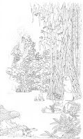
It's INKED! It was quite a journey, but I've gotten the ink all on the paper, the underlying pencil lines erased, and although it took two scans to get the whole thing into graphic files (which I then merged using Photomerge and some persnickety personal tweaking since it wasn't perfect), it is now the single image which you see here.

I thought you might like to see some of it closeup, so here's the owl, a bit larger.

Now I have some decisions to make. First of all, I know the ink is waterproof, although I don't know what would happen if I get totally carried away with the water. On the other hand, I don't want to do that anyway because this is on unmounted Bristol board, which is only a little heftier than the weight (and texture) of a file card.

So while I might be able to do some minor washes to get a soft background color in (the sky, for instance, and maybe the water), but I'll keep things pretty dry so the paper doesn't buckle too much.

There's always the chance I could muff it, though, spilling my jar of brush-rinsing water on it, for instance, or splattering it with a juicy pomegranite seed (not likely, but hey), so since I have it as a graphic I could take the file down to the local print shop (or Kinkos if need be) and have them photocopy it onto another sheet of Bristol, which I would take there with me for them to print onto -- in waterproof laser toner or perhaps there are waterproof inkjet inks, I don't know.

Then I could try again.

Who knows what's going to happen here. But at least I have a tentative ace up my sleeve for in case I blow it. After all, it did take several days to ink the thing and I'm running out of time to make too many runs at it.

My ARCs (Advance Review Copies) are due to arrive next Thursday, by the way, then I'll be ramping up to send them out to reviewers and authorities I know. I did get the Sell Sheet written which has all the nitty gritty information that's on the back of the ARC book cover, plus a synopsis and some additional nice blurbs I had handy.

For instance, one from the Boston Globe about my book Beaver Year which I've always cherished: "Beaver Year is the kind of book that will be passed from child to child and become 'dogeared' with affection." And one from School Library Journal about Wild Babies: "A baby-animal book sufficiently different to outclass most of the books of its genre...all ages can enjoy and learn from this book." Both well worth passing along when one is trying to garner good reviews for a new book.

Anyway, I'll keep plugging away at this painting. This weekend, though, tomorrow and the next day, I have a sketching workshop to teach. This one is an oddball -- usually I pull older ladies. This time, out of eight participants, I have one teenager, two twelve-year-olds, at least one woman in her forties, two in their sixties (I think), and a couple of unknowns. My last class was sixty and older. So this will be interesting, comparing the dynamics.


Tuesday, June 17, 2008

Progress on the book cover

The cover is getting there! Today I hope to finish the inking on The Southern Swamp Explorer cover. Here is most of what I have done (the scanner plate on my printer/copier/scanner is too small to take the whole scene ~ later I will scan it in sections and stitch it together in Photoshop, but right now that's not imporant). I have actually gotten a little more done already, but didn't scan it in yet. The butterfly is finished, but not the owl.

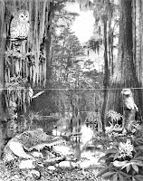
I re-posted the original rough draft here for reference.

You can see, if you click to enlarge the pen-and-ink artwork, that I don't slavishly follow the pencil marks unless it's important (as on the alligator or warbler details). For the trees, for instance, I use the pencil marks as a guide, but just build the trees as I see fit ~ sometimes an extra branch is needed, or a texture I am building doesn't logically stop where the pencil-tracing line does.

The lines in this ink drawing are a bit confusing, as I haven't shaded anything with the ink. I did make the right-hand edge of many of the confusing tree trunks slightly heavier, though, as a guide for when I start painting. It really makes a difference.

You'll notice I haven't done anything with the water. The water is a puzzle. Inklines don't lend themselves to water very well, and it would take me quite awhile to psych things out. I may fudge the water/reflections/ripples/color by leaving them till the very end and doing the water parts in Photoshop. Gasp!

I used to be a purist, wouldn't have even considered doing that. But I've gotten considerably more practical as years have gone by. Sure, I could make that water look good with ink and watercolor pencil and paintbrush, but it would take quite awhile and I don't know if I want to put that much effort into it, just to be macho, when I could ace it in with some creative Photoshop work, chop-chop. After all, that takes skill, too. So we'll see what transpires.
  • To do the water in Photoshop, I would copy the trees in the background, paste the copy on top of the original drawing in a new layer, turn it upside down, darken it, tweak it to fit, erase parts of it where the foreground comes in front of it, then sweep the smudging tool back and forth to make water ripples.
D'you think this might make a good coloring book picture? I was considering perhaps printing it inside the back cover so kids could color it if they want to. If it's inside the back cover, they can easily flip back and forth from front cover to inside back cover to check their progress. Hmmm....

And today I must finish the write-ups for the two new 2-day workshops for the North Mountain Park Nature Center catalog. When I get them done, I will post them here.

Monday, June 16, 2008

Advance Review Copy, Southern Swamp Explorer

I was going to talk about how I'm revising my 3-day workshops into 2-day workshops to better fit into the average (is there such a thing?) artist's pocketbook and available time frames. I worked on that for several hours yesterday, getting the first two workbooks finished and starting on the third of four. But before I do that I want to explain a little about what's been keeping me away from blogging about the workshops.

Just last week I sent The Southern Swamp Explorer (my nemesis and joy for the last seven years) to Fidlar Doubleday to print up 25 Advance Review Copies. Also known as ARCs, and sometimes called Advance Reading Copies, they are sent out to places like Foreword, Rebecca's Reads, Kirkus, Midwest Book Review, and Library Journal to see if they can solicit reviews (good ones, of course) to use in promoting and to quote on the back book cover.

Also, a few of these ARCs will go out to people who are prominent in the field to which the book refers, in this case, swamps, ecology, biology, nature centers, etc., to elicit more nice blurbs for the back cover.

The ARC is typically not quite ready to print, perhaps having not yet gone through the final proof, and specifically NOT having a finished, ready-to-sell cover. This last is important because the reviewers want to be sure they are reviewing a book that is not yet being sold. In fact, they want to receive their review copy 3-4 months before its proposed publication date. So the images on this blog are what the covers look like for The Southern Swamp Explorer ARC cover: not in color, not the finished art, and with information aimed specifically at the reviewers.

In case you're wondering, I paid $4.60 apiece for the 25 books (plus shipping). The Southern Swamp Explorer has black-and-white illustrations on almost all of its 128 pages. I have approved the proof ~ that's what the images on today's blog were scanned from ~ and the printed books should be arriving any day.

On the back of the ARC are the details of its publication date, distributors, a very nice quote from the foreword (which was written by a professor in Environmental Communications at Loyola), and since I don't yet have any reviews or blurbs yet, I included blurbs from The Redrock Canyon Explorer, which is the first book of this series and which say nice things about that book's beauty and usefulness as a guide to the Redrock Country, and from Illustrating Nature ~ Right-brain Art in a Left-brain World which say nice things about my art capabilities.

And I list all the swamps that have preordered copies of the swamp book. That really looks impressive!

When I get some reviews back (fingers crossed ~ sometimes you send out review copies and get very little in return for all your time, trouble and money spent) I will put excerpts from the best ones on the back cover, prepare a scan of my finished full-color cover for the front, and send the book off to the printer for 1000 copies. I'd like to print more in order to get a better price break, but with times the way they are just now I'm going to be conservative and see how well they sell before I put in a big order (2000 copies is a big order for my little Nature Works Press).

So that's the story of some of the final stages of launching a book. Now, I'd better get back over to my desk and work on that cover. The inking is about 3/4 done now, and I can hardly wait to get to the watercolor pencil painting part! Maybe I'll post a progress report on the cover tomorrow.

Saturday, June 14, 2008

Painting the The Southern Swamp Explorer Cover

Yes, workshops are definitely still on my mind, and I'm developing a couple of short ones (lasting just one weekend, or maybe just one day!) for the next North Mountain Park Nature Center catalog. But I am also working very hard on the cover painting for The Southern Swamp Explorer. I'll come back to the workshop stuff in the next blog, but I thought you might be interested in seeing what goes into a cover painting. Click on the images for bigger pictures.

Here's the cover mock-up I settled on, using many of the suggestions I received from about 20 people to whom I sent it for critique. I've managed to get about halfway through the inking now, and I'm going to put up step-by-step photos I took during the process so you can follow along. Remember, this mock-up is a collage of photos and my drawings that I montaged together in Photoshop to form a rough. It's just a pattern to follow. It measures about 11x14."

I decided to try a new style using pen and ink and watercolor pencil painting, and since I haven't done any pen and ink in years (well, ballpoint for my journals, but that's an ENTIRELY different thing), it has been pretty intimidating and I think of all manner of things to help me procrastinate. The pen I'm using is a very fine (.05mm) Copic Multiliner which features waterproof pigment ink. I tested it, scribbling on a piece of the paper I'd use for the cover painting, letting it dry, then wetting and scrubbing it a bit. The lines stayed crisp and firm, with no staining of the white paper.

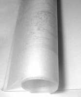
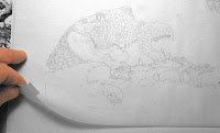
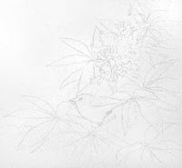
The first step was to trace the mockup onto a large sheet of tracing paper, which I did by putting the Photoshop printout of the cover face down on my light table, then tracing it -- so that the graphite pencil tracing was backward.

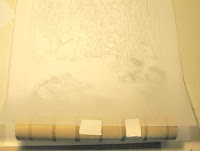
Placing this backward drawing graphite-side down onto my art paper (Smooth Strathmore Bristol, 400 series), I taped it down at the top, then attached a paper towel roll to the bottom edge so that I could roll it up out of the way.

This is a bit unorthodox. Usually the technique is to burnish the entire pattern down onto the paper, but it is easy to smear this, and I didn't want to have to erase or repeat the burnishing, so I only planned to burnish down small portions of the design at a time -- you'll see.

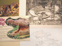
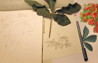
I spent quite a bit of time gathering resource materials because I would need to put details into the finish drawing that I hadn't bothered to trace from the rough.

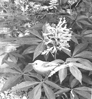
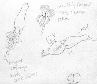
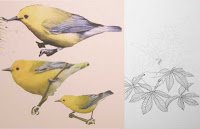
I've shown some of the resources I used: photos I have taken myself, printouts from the web, an actual red buckeye leaf, a sketch I did long ago of buckeye flowers, etc. I'll need all of these not only to get this original inking down, but also to get the color right later when I do the watercolor pencil painting.

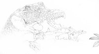
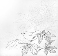
Being right handed, I usually start in the upper left-hand corner of a drawing so as not to smear things, but I wanted to do the foreground first, so I started at the bottom edge with the alligator and the prothonotary (pro-THON-uh-tary) warbler perched on a low-growing red buckeye branch. After I had burnished that portion onto the Bristol, I rolled the tracing sheet up to the top of the picture out of the way and left it there so I could work unimpeded.

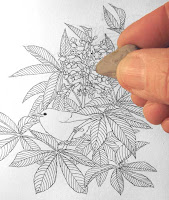
Here are some pictures of the process, including one in which I am erasing the pencil lines out from under the ink. The eraser is a kneaded eraser, and it is gentle enough to remove the pencil without taking out the ink.

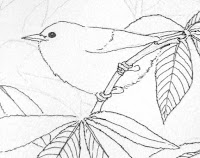
Here's a close-up of the warbler in progress and also finished in its shrub.

So here we are with the foreground inked, mama alligator assisting her nestlings to hatch by cracking a shell with her teeth (truth!) and the prothonotary warbler commenting from the nearby buckeye.

Now it's time to go to the middleground and insert the otter, who has risen on his hind legs to get a better view.

Actually, I've gotten a bit further along, having inked in the bald cypress with the big buttresses behind the otter, but I haven't tweaked the photos so I won't put them in yet. Since I haven't installed adequate photo lights to take the pictures, I've just been snapping photos with my Canon PowerShot A590, and have to do quite a bit of tweaking the photos I take to 1. remove the yellow cast, 2. lighten up the whites and darken the blacks, and 3. correct for unbalanced lighting which makes the photos very dark in the lower right corner. It takes several minutes to correct each picture.

So now I've spent most of the morning (OMG, it's after 2pm! I get so engrossed I lose all sense of time!) procrastinating (good at it, aren't I?), and I'm REALLY going to have to get back to work on it.

More later. More workshop stuff, too.

Friday, June 6, 2008

Nature Journaling & Sketching ~ 5-24&25&31-08

This was a VERY small class.
I usually require a minimum of five students, but only four signed up for this one, and since sometimes a hopeful participant will drop by at the last minute and ask if there's still room (that's chancey ~ sometimes there isn't), I decided to go ahead and set up for the class at The Grove, a nice classroom with great north light and pretty good ambience for a public meeting place. (There's also a microwave and sink, perfect for hot lunch-making.)

Maybe my low attendance was a result of the fact that this was the first workshop of the season and the catalog had just been out for a bit over a week ~ and then it required the students to come on two weekends, one of which was Memorial Day (duh!). I think I still have some things to learn about scheduling. . . .

In the end, though, I wasn't sorry I went ahead with it. The three women, Esther, Eileen and Darrelle, who came for the class were a pure delight. My fourth student never appeared ~ imagine that!

DAY ONE ~ Sketch in Your Journal
As usual, we started out with an examination of various types of sketchbook/journals. My Hawaii journal from Christmas 2007 and my Costa Rica journal from last February got us all in the mood, and I jumped right into teaching them how to make their own journals lively with both sketches and creative writing.

After some basic right-brain exercises I had them do contour drawings of one hand. This is done without looking at the paper, so sometimes the results are a little goofy. I was intrigued with the one Eileen did ~ she was having such fun she drew around the outline of her hand twice without looking!

Then they each tried a contour drawing of a shell, drawn right in the workbook ( I always provide the workbooks to keep things on track and give my students something to take home to consult later), first without looking at their drawings, then another drawing, glancing at both the shells AND their drawings as they drew.

By then they had acquired enough confidence to try drawing a leaf, and the results were quite fine, don't you think? Eileen and Esther claim to be beginning artists, and Darrelle is, in her estimation, between beginner and intermediate. Check these drawings out ~ they were done in about fifteen minutes.

After lunch we studied journal page design for awhile, looking at good and poor design, some interesting ways to design journal pages, and all manner of things to attach or include in a journal. Then I got out my box of seashells so that each could select one to draw. I also handed out free-form shapes to trace around onto their journal page, into which they could write a journal entry. This is a good way to start thinking "out of the box " of boring square paragraphs with nicely justified edges, etc. I was pleased to see that these students scarcely needed the push.

We did quite a few other things, as well, learning how to draw pinecones, shading techniques, and other interesting things. All too soon, the day was done and we folded up for the afternoon.

DAY TWO ~ Journal in Your Sketchbook
I started out Day 2 with an example of how creative writing can turn a boring journal entry into a sensual delight: My boring entry read: "5/28, planted 2 ponypacks of snap peas"

The improved creative entry started out: "It's sunny today with a slight breeze, and the blossoms on the madrone trees fill the air with a sweet honey scent..." etc., continuing for a couple more paragraphs.

The creative entry has a quick contour drawing of the baby pea plants, then a more detailed one colored with watercolor pencils. There's even a haiku under one drawing:

I had them close their eyes as I read it to them, so they could more easily imagine the honey-sweet scent of the madrone flowers, a visit from the cat ("The chickenwire keeps Jesse-cat out of the pot ~ he thinks those pots are there for his own personal use."), and the taste of a crisp pea leaf.

Then we did an exercise of drawing-then-journaling about a subject, later creating a haiku, then a poem. The students showed some extraordinary talent here. I was impressed with their efforts.

Later in the day they did some more sketching, then tried their hand at some basic calligraphy, and the "fun font" I have designed. This font makes it easy to add a light-hearted, splash-dash title or caption to a page. We also did some fancy initial caps, which can really add interest to an entry. I was working along with them, demonstrating ways to decorate, design, and add interest to a journal page with fonts, initial caps, sketches and borders.

We also studied journaling in blog form, how to turn blog entries into journal pages, and using ephemera to add interest to a journal page. Our next class would be the following Saturday, and I meant to assign some homework, but I forgot. Phoo.

Eileen has created some gorgeous journal books, but has been too intimidated by her lack of drawing skills to use them. She brought some for us to look at ~ stunning works of art! I hoped she was gaining some confidence in her drawing skills. They ALL were far more skilled artists by the end of this second day than they were that first morning, and, I think, a bit surprised by their improvement. I'm pleased with their progress.

DAY THREE ~ Color Your Sketches
The final day was Color Day. We started out with a step-by-step examination of how to use watercolor pencils. I broke out the watercolor pencils (I must have 150 pencils, all colors) with which they created a rainbow of colors and mixtures on the color wheel printed in their workbooks. Then they experimented with the waterbrushes (these are paintbrushes with water in the barrell ~ perfect for travel sketching. Darrelle sketched one on her leaf page above.), blending and creating new colors by mixing.

To keep it from getting too intense, we then sketched for a few minutes, repeating the contour drawing of the shell done the previous week. The repeat exercise is very revealing ~ this time their confidence in their capability is marked, and the results are faster and better.

Then it was Orchid Coloring-book Time. I've printed an outline of an orchid in the workbook, with the photo from which I drew it. The assignment is to add color as it appears in the photo. This is a really easy way to get comfortable with the watercolor pencil, choosing and applying color with the pencils, and the various ways of using a paintbrush to get desired results.

I did an extensive demo of things they needed to know how to do, then worked at coloring an orchid drawing along with them, demo-ing as I worked. It's good to have a demo first, but some of the information doesn't soak in until they try to do it themselves. Their results were quite good, and they learned enough to get enough self-assurance to tackle the afternoon's project: to draw a pepper then watercolor pencil/paint it.

Eileen had brought a number of fascinating art pieces she had acquired as part of an art-creating/sharing group. She gave us a mini-talk as we ate our lunch and admired the pieces. She also brought a microwave plant press to show us, with which she has pressed flowers in just minutes. I want one, and googling it online I discovered that our local Northwest Nature Shop carries them! Yes!

During the afternoon, for a break, I had the ladies draw some foliage shapes, then add light and shadow colors to them. That was a really popular exercise, because they learned some ways to make foliage look real without having to draw or color every leaf

Then they each chose a pepper and we started The Pepper Project (sometimes I use apples or gourds, whatever colorful things I find at the grocery store). As before, I worked alongside them, lightly, so that I could experience what they were were going through, and so that they could glance over to see how I was handling the different steps. This works really well if the instructor doesn't get too involved in his/her own art.

I had to make sure I stayed involved with all the students' drawings/paintings so that I could advise and help them resolve problem areas. When I have a lot of students I don't work along with them, but hold up an occasional student's work as a good example of what the others should be working for ~ or if no one has quite the right approach, I can do a quick example as a demo. With this small a group, though, it was good to not be hanging over their shoulders all the time, so drawing and painting my own pepper worked out well.

Here are the results, Esther, Eileen, and Darrelle, in that order ~ three very different styles, all of them extremely nice. I was sorry the day had to end, and I think the ladies were, too. We had shared many stories, jokes and hearty laughs throughout the day, and it was a wrench to see it finish.

So that's the workshop. Lots of things happened during the three days that didn't make it into this blog, but you can get the feel of it, I hope. I'm doing my Nature Sketching and Landscape Drawing Workshop in a couple of weeks, June 21-22 and 28. Come join us if you can. I have four people signed up so far.

And if you still haven't planned your summer workshop vacation, there is still room in my Costa Rica Journaling Workshop for more students! This is the workshop of a lifetime, and I feel so fortunate to be able to share it. Come join us July 7-10!

Here's a grab-bag of other entries...

Related Posts with Thumbnails