To join me on a virtual sketching trip, download a travel sketch-journal here.
I add tutorials to them so you can learn the techniques and details you see in the sketchbooks.

My former workshop students asked me to upload my workshop workbooks to make them available to everyone. So you can also download a workbook and give yourself a workshop! Enjoy!


Friday, December 6, 2013

Step-by-step Watercolor Pencil Painting Part II

Okay, so in my last post I mentioned that I had hit the proverbial wall on part of the painting of Lava Butte. 
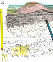
I toyed around with trying to turn the highly stylized jaggedy lines I had made to indicate trees into what they should look like.  In #20 here you can see where I practiced on an extra printout I had made for this purpose—it has the identical b/w drawing and is printed on the same paper stock so my results would be the same—but what I had simply didn't look like a sparse ponderosa forest.
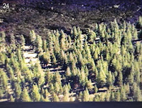
After a day of thought on the knotty subject, I realized there was no way to make it work using what was on the paper. It needed to look more like #24, at right.  
I was going to have to turn my illustration into a computer composite of two separate paintings—a background and a foreground—since there was no way to remove the stylized trees from the already painted part.  Fortunately the edge of the lava flow and the forest made an easy transition point.
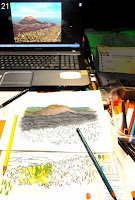
#20 is a photo of my desk and one of the photo images I was using as a reference on my laptop screen.  (I'd show a better copy of the scene, but it isn't my photo and I don't have permission to use it on the blog.  I don't think anyone would object to this small representation, though).  
This is the size the illustration will appear on the trailhead sign, by the way.  It's printed out on an 8½"x11" sheet of heavy paper.  
To guide me in where to draw the new trees, I held the painting up on my glass door so the light would come through it, placed the fresh sheet in front of it, and very lightly sketched the outline that needed filling in with trees on the new sheet.
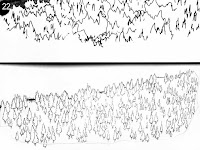
#22 shows the original unworkable stylized forest above and my solution to the illustration challenge below.  Every tree has been drawn within the forest outline and given a tiny little trunk. They were drawn very quickly, though, because this isn't a highly detailed picture, and it only took about half an hour to complete the outlines of all those tiny trees.
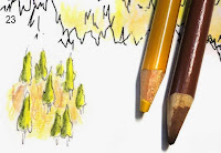
Before I would go any further, I wanted to practice drawing the  earth between the sparse trees. Using the yellow ochre and cinnamon I had designated in my rough palette originally,  I carelessly stroked the pencil lines vertically, which would not correctly interpret flat earth.  Like flat, calm water, which must always be stroked horizontally, I realized I would have to stroke all that area between the trees horizontally.  I was glad I had not just started out on the actual artwork.
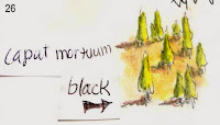
Using #24 (at the beginning of this post) as a guide, I made the trees cadmium yellow lemon on the side catching the light, and cedar green on the shadow side. Each tree would need a shadow on the ground, also, and I experimented with caput mortuum and black in #26, but the caput mortuum made the earth appear too reddish, so I decided to go with black on my final illustration.  

Finally, in #27, you see the trees pretty much as they appear on the final illustration. Now I needed to fill in the earth  and make the shadows.   
On my practice sheet I tried out some black shadows, but they looked way too harsh, so instead, beside each tree I put a little lozenge of warm gray deep. Better! Now the trees looked ready to join via my computer graphics program into one picture.
Scanning the two illustrations into my program, I enlarged the lava butte canvas at the bottom, and pasted the trees from the other file onto a new layer, cutting and erasing away most of the white along the treeline.  Now I could see that the trees were a bit gaudy-looking, being too yellow, so I calmed the tree layer down until it more closely matched the feeling of the lava layer.   The tree layer needed to be smoothly integrated with the lava edge because I could see white outlines where I had roughly removed the white background behind the trees.
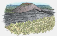
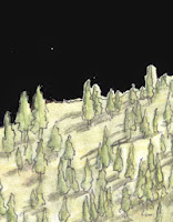
The best way to do that was to put a temporary black layer behind the trees to make them stand out, then go in with a small eraser tool and erase out around the trees.  In the image with the black background, I have finished the trees on the left half.  
Once the trees were cleaned up, I got rid of the black layer and smoothed the lava on the lava layer with the clone tool to make sure it flowed nicely behind the trees.  
To give the lava layer some thickness, I darkened the edge where it meets the trees, using the burn tool. 
Look closely at the sky in the image above. As I predicted in the previous post, that color of turquoise blue turned granular during the scan, so I knew I'd have to repaint the sky in the graphics program. 
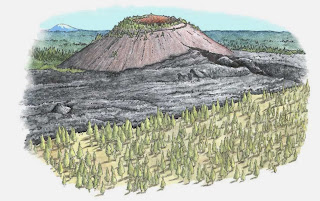
To do this, I dabbed the color picker in a "good" spot on the sky to select that color, made a very large brush, and painted in the sky a solid turquoise blue.  With a small brush, I went in closer and made sure the sky joined to the horizon smoothly. And finally, with a large eraser tool set very low, I smoothed out the edges of the sky to blend them out to nothing.
Then off it went via email for its debut with the client.
They liked it, with a couple of requests. 
1.  they wanted the sky to be light on the horizon deepening to the deep blue you see in the high desert, making it higher and giving the entire image a more more square ratio.  
2. they wanted the lava butte to be the same color as the lava, and they felt it should be darker.
All of the photos I had referenced showed the butte ALL different colors, depending on how the sun hit it, but I knew it should be roughly the color of the lava.  Still, wanting to get the picture a little more colorful I had put a little caput mortuum into the mix.  My bad.  
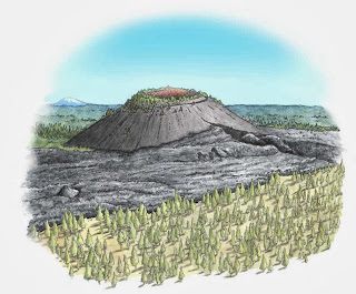
The cinder cone first: With the sponge tool set very low so I could work gradually, I desaturated (removed the color) from the black of the cone, being careful not to desaturate the trees, too. Then, with the burn tool set on "highlights" at a very low setting, I gradually darkened the shadow side of the cone, working around the cone carefully to make a smooth transition.  The two fixes only required about half an hour of work, and I was perfectly happy to make them.  Then I sent it off to them (a small JPG through email—the larger TIF file will later be uploaded to the server).
They liked the changes (I did, too, especially the sky), and requested one more: Could the sky be given "corners" to better fit the space on the sign? Sure!  Not problem: working on a copy of the original (just in case I muffed it), and using the clone tool with a very large brush, I cloned the center of the sky, and pulling down a horizontal guideline I simply ran the clone tool to each side along the level line until the entire sky was the height of the center, squaring it off nicely.  I used a large eraser set on very low again to blend off the edges, and sent it back again for approval.

And here it is, the finished watercolor pencil painting, ready to go on the trailhead sign..  
I hope you enjoyed this little jaunt through a watercolor pencil step-by-step tutorial.

And yes, that sky IS a realistic color, and in fact I've seen it an even darker blue.  
In the Oregon High Desert country there isn't a lot of pollution to get between you and the sky. 


Thursday, December 5, 2013

Step-by-step Watercolor Pencil Painting of Lava Butte

Dang!  Sidetracked again. I HAVE been working on the re-edit of Illustrating Nature, and in fact I have worked my way mostly through it (still have to rewrite the computer chapter) but I had to stop and work on illustrations for interpretive trailhead signs I had previously contracted for.  

That's not to say I'm not enjoying working on the trailhead sign art—just that it's not what I said I'd be doing right now.. The reworking of Illustrating Nature is going great, and I'm thinking it might go to press in February or so. At right is one of the many illustrations I've added—this one to show how a bird's bill opens. The hinge is actually behind the eye, not at the edge of the opening as you might think....

 In the meantime, I thought I'd give you a peek at the watercolor pencil painting process I've been working through on the trailhead signs. 

I was keeping track of the steps because I wasn't sure I was on the right track with it, and if I did something good I wanted to be able to repeat it. So every time I added a new color I took a snapshot of it with my little digital camera (I know, I know, everybody else uses their cellphone, but being a troglodyte, I don't have one). 

Anyway, as I was working along it dawned on me that I have been letting y'all down by not posting in so long.
So herewith, I post my work process on Lava Butte, a small volcanic cone just south of Bend, Oregon.  It's quite a fascinating place, with the cone jutting up out of the earth, and its lava flow that covers the ground like cake dough, the rough black cindery edges dropping off suddenly to powdery yellowish soil (originally just ash, if I remember correctly) sparsely covered with pine trees.  

For each step, I wrote down on a little slip of paper the name of the watercolor pencil I was using, and placed it next to the area I just worked on. So in photo #1, the slip of paper reads "caput mortuum," which is the name of that pencil.  
To digress slightly...the "ink drawing" is a highly contrasted pencil drawing I scanned into Photoshop then printed out on heavy paper that would take the pencil well, then let me add water to blend it without buckling or disintegrating. 

So in #2, I have penciled over the caput mortuum with gunmetal gray.  I have used the watercolor pencils fairly lightly because while you can always add more, you can't remove color very well.
Warning ~ if you have ever tried to photograph artwork (except in well-controlled lighting circumstances, you'll know that I had to do quite a bit of work to lighten these and get reasonably faithful colors. I was working under diffuse sunlight coming through the window and fluorescent lights, and while the images looked great on my camera view screen they were a LOT darker when I uploaded them into the computer.  You can see in that dark image after #4, what it looked like before I tweaked it.
In #3, you'll see the little slip of paper that said "painted."  


By that I mean that I blended the colors with my waterbrush to get the color you see there. In case you aren't familiar with the waterbrush, I blogged about it a little here

#4. I've begun to work on the orangey cinders found within the mouth of the cone.  I'm using terra cotta and a bit of caput mortuum in the shadow areas, and in #5 I waterbrushed again.


#6. When working with watercolor pencil paintings, you must wait to let things dry before adding more color to an area, or you will get uneven and blotchy color.  So while the inside of the cinder cone was drying, I added more pencil to the outside of the cone. While THAT was drying, I penciled in some turquoise blue sky.

#7. Turquoise blue can be a real problem.  When you scan that particular color into a graphics program, it often becomes granular or parts of it drop out entirely. This might just be my scanner or graphics program, but it's been a problem I've had  to work around.  
I left out #8, because my tweaking couldn't get it even close to the others.

In #9, I started on the far-away mountain and the trees.  When green trees, such as the ones in the forest and flanking the mountain, are this far away, the atmosphere comes between the viewer and the green of the trees, getting bluer the farther away they are.  By the time the trees get to the mountain here, I can duplicate the color with the cobalt blue-greenish watercolor pencil. 

#11 (there isn't a #10) I added juniper green to the nearer trees, with a bit of the cobalt blue-greenish in diminishing amounts the closer it gets.  I then painted the further-off trees, and when they were dry I went back over the blue with the juniper green and a little turquoise blue just to get the colors nicely blended and matched a little better with the sky.   The juniper green in #12 has just been penciled in here, and it's ready to be painted.
Up to this point, the picture has not been very encouraging to look at. I keep wondering if this is going to work.  But now, with the forest coming along, it's starting to appear the way it should.


You'd think by now I'd have a little more confidence, but I'm afraid it never seems to get any better.  Sheesh!
If you click on the close-up here you can really get into the details of the pencil and brushwork.

With #13, I have waterbrushed the far forest and the closer parts, adding deeper color when it dried, then wetting it again.  

Painting with watercolor pencils is an additive sort of thing, and while one part is drying another part can be added to and darkened.  The paper I use dries quickly, so if I work on a different area for a just a few minutes, when I come back the original area is dry.

In #13, I've penciled on some color, but now I have to start using a different technique since there are some tiny trees on the flanks of the cinder slope that I want to make green.  With the brush tip I pull color off the end of the juniper green pencil and apply it to the little green trees.  This gives me much more precise aim than trying to get into the spot once with the pencil point to lay down color then again with the brush to wet it in. Additionally, I can get a nice intense color on the brush by dabbing repeatedly at the pencil, so it only takes one application of color.
In #14, the last one I've got ready for today (the painting is finished now and sent off to the client, but I only had time to tweak the first half of the photos), I've painted in the juniper green trees on the sides of Lava Butte, and deepened the cinder color within the cone.  

My next step will be to tackle the lava flow that comes up to the foot of the cone, and the foreground of trees and ashy soil they're growing in.  


The last image here is the rough I sent to the client along with the color palette I expected to use on various parts of the picture.  I have worked with this client before and she trusts me to do things right, so this minimalist rough worked for us.  Usually, at least part of the work would need to be colored in for the client.  

Although the client had approved the rough, I was very aware that the forest in the foreground was NOT well represented—I couldn't see how I could make it translate to how this area actually looks, and I had already put the painting off longer than I should because I was trying to work out the solution in my mind.  
The dead black of the lava troubled me, as well, because it's not considered the sign of a good artist to use a lot of black in a painting, but, well, lava is dead black....

So I took a day off to ponder further at this point, then got back to work.  More in the next post.
I hope you'll come back to see the rest of the story! 

Thursday, October 24, 2013

New Project!

Hey, authors get do-overs!  I never thought about it that way, but when a book needs a new look, new information, new status, we get to redo it!  Of course, there's a LOT of work involved, but the end result is that we get to erase the wrinkles, firm up the sagging body parts, and try a new hairdo on the book. Quite a perk.

Here's my perennial favorite book, Illustrating Nature, Right-brain Art in a Left-brain World, which is a do-it-yourself guide for the aspiring illustrator, starting from zero if that's where you are, and taking you as high as you want to go ~ ahem... well, it depends on whether or not you stick with it.  

When I taught my Biological Illustration course from it a few years ago, using the handouts that became the basis for the book, the class enabled I-can't-draw-a-straight-line-but-I-need-the-credit students to get their Project B artwork published in nature periodicals after just one term of study.  But once a you publish a book and it goes out into the world, you (the author/illustrator) seldom get any feedback from folks who buy it.  Sighhhhh......

But I got lucky!    

One of my students from long ago, Pete Schroeder, went on to teach Biological Illustration  at Southern Oregon University, the very course I had once taught. Although he was my student back then, he started out at a pretty high level of artistic expertise, and I just helped him polish his skills. His artwork is stunning, and he's also an excellent teacher. When I moved on to teaching sketching and journaling workshops out in the wide world, he took over the course using Illustrating Nature, and has been turning out some really good artists for several years now. 

On the left is an ink drawing, which was then computer-tweaked to resemble a pencil drawing (right).
Problem is, the book has sections that have become a little dated as the technology whizzes along at breakneck speed, and although most of it is fine, some parts, like the ones discussing computer tweaking illustrations and career opportunities, need some work. 

Pete generously offered to meet with me and give me feedback on what could use some changes, and after an intense session involving every aspect (including the possibility of making it into an eTextbook) I came away with a some good ideas on how to improve on it.  I'm already well into Chapter 3.  I'll get together with him again later to see if I'm on the right track.  

So, the Redwood and Beach sketch journal I began in early September has settled into its spot by the couch, waiting for me to find spare moments to add color to the drawings, but it's going to be awhile before I get moving on it.  

The thought of putting Illustrating Nature into e-book form is a little daunting, I have to admit.  When I upload my sketch journals for people to download and enjoy, I just create them as I would create a book, make them into PDFs and upload them.  But eBooks are done in code and have links, and you can't format them because everyone has a different kind of reader ~ from full size computer to cellphone ~ and if you've seen Illustrating Nature, you know that I format the heck out of it.  

In an eBook, every illustration marches down the middle of the page, one by one.  Like this:

As far as I know, you can't even put two illustrations side by side.  So that means that if I want two illustrations side by side, I'll have to join the illustrations into one graphic in Photoshop before inserting them into the text. I did that just now with the little wood ducks above, because they were originally two separate images. It's not a HUGE amount of work, but the book has hundreds of images, so it would be a lengthy process.  I can see I'd have my work cut out for me.  I still haven't definitely decided to do the eTextbook, but there's a good possibility. 


So.  There's where my life is at the present.  (Ha!  A big turkey hen just landed on my roof with a major THUMP.  It's getting dark, and she's probably about to fly up into a tree to roost for the night. Now THAT's an amazing sight I've only seen a few times. They look so amazing, huge lumps up in the trees.)  

Here's an illustration from one of my sketch journals a couple of years ago of a hen turkey doing just that. She's all fluffed up around her perch to keep warm.

Glad you came by.  If you've been using Illustrating Nature, I hope you'll comment with anything you'd like me to add or change.  Here's your chance!  

Tuesday, October 1, 2013

Finally! A Road Trip!

Mouse in the Redwoods
SO!  After months of rebuilding, refurbishing, revamping, revisioning, and redoing, Mouse (my 1985 22' Toyota Mini-Motorhome) and I FINALLY got things completed enough to take a 5-day trip to Redwood National Park and California Beaches!  It felt so fine to finally, after all that thinking, planning and re-(insert gerund of choice here), to actually hit the road on our first real sketching trip. 
THE sketch from my first trip
It's the second one, actually, as the first one up near Crater Lake (about 70 miles away) lasted one day then got rained out.
We took off on the 4th of September winding along the curvy road to the coast off I-5 at Grants Pass, OR.  That's a lovely road, although some people think it's horrendous with its curves which have you slowing to 20mph on occasion, and road cuts with Beware Falling Rocks signs. The views are terrific, though, as you wind through river canyons, a great long tunnel, and finally into the towering redwoods  just before you start inhaling salty air of nearby beaches. 


Blacktail deer beneath the Redwoods
Mouse is easy to drive, easier even than my little car which gets 27mpg, so we had a fine trip although it helps to have patience on the uphills. We moseyed along at 35mph in places, since there's a lot of weight in a motorhome and it's a hard pull.  I'm still looking for a bumper sticker I once saw that read "Zero to sixty in thirty minutes."  If you know where I can get one, let me know......it defuses the situation for those stuck behind me, although I am a paragon of virtue about using pullouts so people can get past.
A banana slug, six inches long.

I'm not going to go into lots of details about this sketching trip, although I will tap lightly on the high points.  I stopped for a long walk in the redwoods, lots of photos and some sketches, including one of a remarkable 6" long banana slug which I discovered in one of the memorial redwood groves. 
A lovely scene at DeMartin Beach
My sketch of the lovely scene
 Then I skedaddled for the beach where I just sat and inhaled for awhile, finally settling down to draw some wonderful rocks and logs at DeMartin Beach before heading for my first campground at Mill Creek State Park.  

Check out the steps, marked with arrows. This stump is 5' tall.

Mill Creek is a lovely campground down in the creek bottoms in what was once a magnificent redwood forest. It's a redwood forest again, but still growing back after long-ago logging. My campsite was next to a redwood stump about 8' across and 5' high. The loggers had chipped STEPS into it for a place to stand while they sawed.  It sorta dwarfed Mouse, and made me a little uneasy. At least the forest here is protected now, and will, someday, be a lovely old-growth forest again.


Sponges and kelp in the tidepools
The next day I camped in Patrick's Point State Park, which is on a bluff above a rocky beach. Rocky beaches are my favorites, as they have tidepools with fascinating things in them for drawing. 
These are seals ~ seal lions were farther away

These rocks also had a congregation of sea lions honking hymns ("AROONK!  AROONK! AARK! AROONK!") out on a small rocky island below the bluff, and a colony of basking silver seals which kept demurely silent, squawking only when, while in deep sleep on a low rock, a dowsing wave of the rising tide swamped them. Then they'd let out a startled, disgusted "Araaaacghkkkkk!" (I had trouble spelling that, as you can see!).


The bottom end of the climb
182 steep steps & path down
Climbing down to the tidepools at Palmer Point was a major effort. It was 182 steep steps down and then up again, with tiers of steps separated by steep scrambles. It was a wearing trek bookending an energetic scramble over the tidepool boulders. But I found great sketching subjects and gorgeous vistas peopled with seals and gulls (and hardly any humans, since it's after Labor Day), so it was well worth it. I scrambled up and down it again the next morning, quite gladly.


A crab in a tidepool
I spent the next night in an RV park in McKinleyville to access WiFi, recharge my camera batteries, get a shower, etc.  Mouse has a shower, but I disconnected it since the RV already has had too much water damage done to its structure and doesn't need any more hot showers adding to the problem.
Windy Clam Beach

The next day was spent beachcombing on a long sandy beach (Clam Beach, a windy spot!) before driving up to Prairie Creek Campground to camp in the redwoods again and visit with herds of elk.  Prairie Creek is in a big "elk meadow" and you're almost guaranteed to see elk there. Spotting a lot of cars out along the road (shades of Yellowstone Park!), I drove Mouse out to park beside the road,
My sketch from the top of Mouse
climbed up on top with my camera, binoculars and sketchpad, and spent a couple of hours observing a big stag bugling (one of the most amazing sounds in the animal kingdom!) and rooting up grass and shrubs to decorate his antlers as he challenged an incoming stag circling his harem. It was quite a show, and I had by far the best view in the arena, sitting on Mouse's roof which is 8' off the ground.

The view from the top of Mouse

Since I didn't stay in one place for more than a day on this trip, I did quite a bit of driving, which, along with long hikes along the beaches and lots of clambering around on slick wet boulders, made me pretty tired at the end of each day.  

Lots of cool things to sketch
As a result, I didn't spend the evenings, as I have with past sketchbooks, coloring the sketch pages with my watercolor pencils.  This is a great thing to do in a hotel room, since there isn't a much more boring place in the universe than a hotel room. But in Mouse, I can cook, eat, go outside into a lovely spot to wander and photograph nature or sit in my camp chair, and find a hundred other ways to be distracted. 

A sedum fallen from the cliff
To enable me to work on the sketches later,  I took several hundred photos on this trip, and journaled in my daily journal (I don't keep it up daily at home, but on trips like this I do journal a lot) so that I could add descriptions to the sketch pages later.  
The photos and journal would help me add details to the drawings and get the colors right as I finished sketches later.

I'm home now, and working on the sketchbook, loving every minute of it. 
I've discovered if I set aside a daily dedicated block of time to work on the journal, it's more likely to get finished in a timely manner.  I'll post again when I'm further along (or finished) so you can see the results of My First Sketching Roadtrip in my little Toyota Mini-motorhome, Mouse. 

Here's a grab-bag of other entries...

Related Posts with Thumbnails