To join me on a virtual sketching trip, download a travel sketch-journal here. I add tutorials to them so you can learn the techniques and details you see in the sketchbooks.
My former workshop students asked me to upload my workshop workbooks to make them available to everyone. So you can also download a workbook and give yourself a workshop! Enjoy!
 Okay, so in my last post I mentioned that I had hit the proverbial wall on part of the painting of Lava Butte.
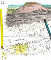
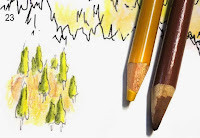
I toyed around with trying to turn the highly stylized jaggedy lines I had made to indicate trees into what they should look like. In #20 here you can see where I practiced on an extra printout I had made for this purpose—it has the identical b/w drawing and is printed on the same paper stock so my results would be the same—but what I had simply didn't look like a sparse ponderosa forest.
Okay, so in my last post I mentioned that I had hit the proverbial wall on part of the painting of Lava Butte.
I toyed around with trying to turn the highly stylized jaggedy lines I had made to indicate trees into what they should look like. In #20 here you can see where I practiced on an extra printout I had made for this purpose—it has the identical b/w drawing and is printed on the same paper stock so my results would be the same—but what I had simply didn't look like a sparse ponderosa forest.
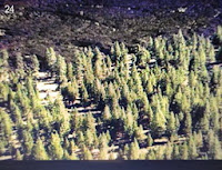 After a day of thought on the knotty subject, I realized there was no way to make it work using what was on the paper. It needed to look more like #24, at right.
I was going to have to turn my illustration into a computer composite of two separate paintings—a background and a foreground—since there was no way to remove the stylized trees from the already painted part. Fortunately the edge of the lava flow and the forest made an easy transition point.
After a day of thought on the knotty subject, I realized there was no way to make it work using what was on the paper. It needed to look more like #24, at right.
I was going to have to turn my illustration into a computer composite of two separate paintings—a background and a foreground—since there was no way to remove the stylized trees from the already painted part. Fortunately the edge of the lava flow and the forest made an easy transition point.
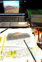 #20 is a photo of my desk and one of the photo images I was using as a reference on my laptop screen. (I'd show a better copy of the scene, but it isn't my photo and I don't have permission to use it on the blog. I don't think anyone would object to this small representation, though).
This is the size the illustration will appear on the trailhead sign, by the way. It's printed out on an 8½"x11" sheet of heavy paper.
To guide me in where to draw the new trees, I held the painting up on my glass door so the light would come through it, placed the fresh sheet in front of it, and very lightly sketched the outline that needed filling in with trees on the new sheet.
#20 is a photo of my desk and one of the photo images I was using as a reference on my laptop screen. (I'd show a better copy of the scene, but it isn't my photo and I don't have permission to use it on the blog. I don't think anyone would object to this small representation, though).
This is the size the illustration will appear on the trailhead sign, by the way. It's printed out on an 8½"x11" sheet of heavy paper.
To guide me in where to draw the new trees, I held the painting up on my glass door so the light would come through it, placed the fresh sheet in front of it, and very lightly sketched the outline that needed filling in with trees on the new sheet.
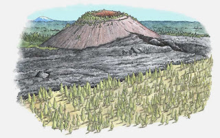
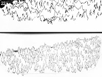 #22 shows the original unworkable stylized forest above and my solution to the illustration challenge below. Every tree has been drawn within the forest outline and given a tiny little trunk. They were drawn very quickly, though, because this isn't a highly detailed picture, and it only took about half an hour to complete the outlines of all those tiny trees.
 Before I would go any further, I wanted to practice drawing the earth between the sparse trees. Using the yellow ochre and cinnamon I had designated in my rough palette originally, I carelessly stroked the pencil lines vertically, which would not correctly interpret flat earth. Like flat, calm water, which must always be stroked horizontally, I realized I would have to stroke all that area between the trees horizontally. I was glad I had not just started out on the actual artwork.
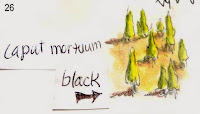 Using #24 (at the beginning of this post) as a guide, I made the trees cadmium yellow lemon on the side catching the light, and cedar green on the shadow side. Each tree would need a shadow on the ground, also, and I experimented with caput mortuum and black in #26, but the caput mortuum made the earth appear too reddish, so I decided to go with black on my final illustration.
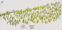 Finally, in #27, you see the trees pretty much as they appear on the final illustration. Now I needed to fill in the earth and make the shadows.
 On my practice sheet I tried out some black shadows, but they looked way too harsh, so instead, beside each tree I put a little lozenge of warm gray deep. Better! Now the trees looked ready to join via my computer graphics program into one picture.
Scanning the two illustrations into my program, I enlarged the lava butte canvas at the bottom, and pasted the trees from the other file onto a new layer, cutting and erasing away most of the white along the treeline. Now I could see that the trees were a bit gaudy-looking, being too yellow, so I calmed the tree layer down until it more closely matched the feeling of the lava layer.
On my practice sheet I tried out some black shadows, but they looked way too harsh, so instead, beside each tree I put a little lozenge of warm gray deep. Better! Now the trees looked ready to join via my computer graphics program into one picture.
Scanning the two illustrations into my program, I enlarged the lava butte canvas at the bottom, and pasted the trees from the other file onto a new layer, cutting and erasing away most of the white along the treeline. Now I could see that the trees were a bit gaudy-looking, being too yellow, so I calmed the tree layer down until it more closely matched the feeling of the lava layer. 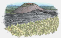 The tree layer needed to be smoothly integrated with the lava edge because I could see white outlines where I had roughly removed the white background behind the trees.
 The best way to do that was to put a temporary black layer behind the trees to make them stand out, then go in with a small eraser tool and erase out around the trees. In the image with the black background, I have finished the trees on the left half.
Once the trees were cleaned up, I got rid of the black layer and smoothed the lava on the lava layer with the clone tool to make sure it flowed nicely behind the trees.
To give the lava layer some thickness, I darkened the edge where it meets the trees, using the burn tool.
Look closely at the sky in the image above. As I predicted in the previous post, that color of turquoise blue turned granular during the scan, so I knew I'd have to repaint
the sky in the graphics program.
The best way to do that was to put a temporary black layer behind the trees to make them stand out, then go in with a small eraser tool and erase out around the trees. In the image with the black background, I have finished the trees on the left half.
Once the trees were cleaned up, I got rid of the black layer and smoothed the lava on the lava layer with the clone tool to make sure it flowed nicely behind the trees.
To give the lava layer some thickness, I darkened the edge where it meets the trees, using the burn tool.
Look closely at the sky in the image above. As I predicted in the previous post, that color of turquoise blue turned granular during the scan, so I knew I'd have to repaint
the sky in the graphics program.
 To do this, I dabbed the color picker in a "good" spot on the sky to select that color, made a very large brush, and painted in the sky a solid turquoise blue. With a small brush, I went in closer and made sure the sky joined to the horizon smoothly. And finally, with a large eraser tool set very low, I smoothed out the edges of the sky to blend them out to nothing.
Then off it went via email for its debut with the client.
They liked it, with a couple of requests.
1. they wanted the sky to be light on the horizon deepening to the deep blue you see in the high desert, making it higher and giving the entire image a more more square ratio.
2. they wanted the lava butte to be the same color as the lava, and they felt it should be darker.
All of the photos I had referenced showed the butte ALL different colors, depending on how the sun hit it, but I knew it should be roughly the color of the lava. Still, wanting to get the picture a little more colorful I had put a little caput mortuum into the mix. My bad.
To do this, I dabbed the color picker in a "good" spot on the sky to select that color, made a very large brush, and painted in the sky a solid turquoise blue. With a small brush, I went in closer and made sure the sky joined to the horizon smoothly. And finally, with a large eraser tool set very low, I smoothed out the edges of the sky to blend them out to nothing.
Then off it went via email for its debut with the client.
They liked it, with a couple of requests.
1. they wanted the sky to be light on the horizon deepening to the deep blue you see in the high desert, making it higher and giving the entire image a more more square ratio.
2. they wanted the lava butte to be the same color as the lava, and they felt it should be darker.
All of the photos I had referenced showed the butte ALL different colors, depending on how the sun hit it, but I knew it should be roughly the color of the lava. Still, wanting to get the picture a little more colorful I had put a little caput mortuum into the mix. My bad.
 The cinder cone first: With the sponge tool set very low so I could work gradually, I desaturated (removed the color) from the black of the cone, being careful not to desaturate the trees, too. Then, with the burn tool set on "highlights" at a very low setting, I gradually darkened the shadow side of the cone, working around the cone carefully to make a smooth transition. The two fixes only required about half an hour of work, and I was perfectly happy to make them. Then I sent it off to them (a small JPG through email—the larger TIF file will later be uploaded to the server).
They liked the changes (I did, too, especially the sky), and requested one more: Could the sky be given "corners" to better fit the space on the sign? Sure! Not problem: working on a copy of the original (just in case I muffed it), and using the clone tool with a very large brush, I cloned the center of the sky, and pulling down a horizontal guideline I simply ran the clone tool to each side along the level line until the entire sky was the height of the center, squaring it off nicely. I used a large eraser set on very low again to blend off the edges, and sent it back again for approval.
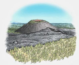
And here it is, the finished watercolor pencil painting, ready to go on the trailhead sign..
I hope you enjoyed this little jaunt through a watercolor pencil step-by-step tutorial.
And yes, that sky IS a realistic color, and in fact I've seen it an even darker blue.
In the Oregon High Desert country there isn't a lot of pollution to get between you and the sky.
The cinder cone first: With the sponge tool set very low so I could work gradually, I desaturated (removed the color) from the black of the cone, being careful not to desaturate the trees, too. Then, with the burn tool set on "highlights" at a very low setting, I gradually darkened the shadow side of the cone, working around the cone carefully to make a smooth transition. The two fixes only required about half an hour of work, and I was perfectly happy to make them. Then I sent it off to them (a small JPG through email—the larger TIF file will later be uploaded to the server).
They liked the changes (I did, too, especially the sky), and requested one more: Could the sky be given "corners" to better fit the space on the sign? Sure! Not problem: working on a copy of the original (just in case I muffed it), and using the clone tool with a very large brush, I cloned the center of the sky, and pulling down a horizontal guideline I simply ran the clone tool to each side along the level line until the entire sky was the height of the center, squaring it off nicely. I used a large eraser set on very low again to blend off the edges, and sent it back again for approval.
And here it is, the finished watercolor pencil painting, ready to go on the trailhead sign..
I hope you enjoyed this little jaunt through a watercolor pencil step-by-step tutorial.
And yes, that sky IS a realistic color, and in fact I've seen it an even darker blue.
In the Oregon High Desert country there isn't a lot of pollution to get between you and the sky.
 Dang! Sidetracked again. I HAVE been working on the re-edit of Illustrating Nature, and in fact I have worked my way mostly through it (still have to rewrite the computer chapter) but I had to stop and work on illustrations for interpretive trailhead signs I had previously contracted for.
That's not to say I'm not enjoying working on the trailhead sign art—just that it's not what I said I'd be doing right now.. The reworking of Illustrating Nature is going great, and I'm thinking it might go to press in February or so. At right is one of the many illustrations I've added—this one to show how a bird's bill opens. The hinge is actually behind the eye, not at the edge of the opening as you might think....
In the meantime, I thought I'd give you a peek at the watercolor pencil painting process I've been working through on the trailhead signs.
I was keeping track of the steps because I wasn't sure I was on the right track with it, and if I did something good I wanted to be able to repeat it. So every time I added a new color I took a snapshot of it with my little digital camera (I know, I know, everybody else uses their cellphone, but being a troglodyte, I don't have one).
Anyway, as I was working along it dawned on me that I have been letting y'all down by not posting in so long.
So herewith, I post my work
process on Lava Butte, a small volcanic cone just south of Bend,
Oregon. It's quite a fascinating place, with the cone jutting up out of the earth, and its lava flow that covers the
ground like cake dough, the rough black cindery edges dropping off
suddenly to powdery yellowish soil (originally just ash, if I remember
correctly) sparsely covered with pine trees.
For each step, I wrote down on a little slip of paper the name of the watercolor pencil I was using, and placed it next to the area I just worked on. So in photo #1, the slip of paper reads "caput mortuum," which is the name of that pencil.
To digress slightly...the "ink drawing" is a highly contrasted pencil drawing I scanned into Photoshop then printed out on heavy paper that would take the pencil well, then let me add water to blend it without buckling or disintegrating.
So in #2, I have penciled over the caput mortuum with gunmetal gray. I have used the watercolor pencils fairly lightly because while you can always add more, you can't remove color very well.
Dang! Sidetracked again. I HAVE been working on the re-edit of Illustrating Nature, and in fact I have worked my way mostly through it (still have to rewrite the computer chapter) but I had to stop and work on illustrations for interpretive trailhead signs I had previously contracted for.
That's not to say I'm not enjoying working on the trailhead sign art—just that it's not what I said I'd be doing right now.. The reworking of Illustrating Nature is going great, and I'm thinking it might go to press in February or so. At right is one of the many illustrations I've added—this one to show how a bird's bill opens. The hinge is actually behind the eye, not at the edge of the opening as you might think....
In the meantime, I thought I'd give you a peek at the watercolor pencil painting process I've been working through on the trailhead signs.
I was keeping track of the steps because I wasn't sure I was on the right track with it, and if I did something good I wanted to be able to repeat it. So every time I added a new color I took a snapshot of it with my little digital camera (I know, I know, everybody else uses their cellphone, but being a troglodyte, I don't have one).
Anyway, as I was working along it dawned on me that I have been letting y'all down by not posting in so long.
So herewith, I post my work
process on Lava Butte, a small volcanic cone just south of Bend,
Oregon. It's quite a fascinating place, with the cone jutting up out of the earth, and its lava flow that covers the
ground like cake dough, the rough black cindery edges dropping off
suddenly to powdery yellowish soil (originally just ash, if I remember
correctly) sparsely covered with pine trees.
For each step, I wrote down on a little slip of paper the name of the watercolor pencil I was using, and placed it next to the area I just worked on. So in photo #1, the slip of paper reads "caput mortuum," which is the name of that pencil.
To digress slightly...the "ink drawing" is a highly contrasted pencil drawing I scanned into Photoshop then printed out on heavy paper that would take the pencil well, then let me add water to blend it without buckling or disintegrating.
So in #2, I have penciled over the caput mortuum with gunmetal gray. I have used the watercolor pencils fairly lightly because while you can always add more, you can't remove color very well.
 Warning ~ if you have ever tried to photograph artwork (except in well-controlled lighting circumstances, you'll know that I had to do quite a bit of work to lighten these and get reasonably faithful colors. I was working under diffuse sunlight coming through the window and fluorescent lights, and while the images looked great on my camera view screen they were a LOT darker when I uploaded them into the computer. You can see in that dark image after #4, what it looked like before I tweaked it.
In #3, you'll see the little slip of paper that said "painted."
Warning ~ if you have ever tried to photograph artwork (except in well-controlled lighting circumstances, you'll know that I had to do quite a bit of work to lighten these and get reasonably faithful colors. I was working under diffuse sunlight coming through the window and fluorescent lights, and while the images looked great on my camera view screen they were a LOT darker when I uploaded them into the computer. You can see in that dark image after #4, what it looked like before I tweaked it.
In #3, you'll see the little slip of paper that said "painted."
 By that I mean that I blended the colors with my waterbrush to get the color you see there. In case you aren't familiar with the waterbrush, I blogged about it a little here
 #4.
I've begun to work on the orangey cinders found within the mouth of the
cone. I'm using terra cotta and a bit of caput mortuum in the shadow
areas, and in #5 I waterbrushed again.
#6. When working with watercolor
pencil paintings, you must wait to let things dry before adding more
color to an area, or you will get uneven and blotchy color. So while
the inside of the cinder cone was drying, I added more pencil to the
outside of the cone. While THAT was drying, I penciled in some turquoise blue sky.
#4.
I've begun to work on the orangey cinders found within the mouth of the
cone. I'm using terra cotta and a bit of caput mortuum in the shadow
areas, and in #5 I waterbrushed again.
#6. When working with watercolor
pencil paintings, you must wait to let things dry before adding more
color to an area, or you will get uneven and blotchy color. So while
the inside of the cinder cone was drying, I added more pencil to the
outside of the cone. While THAT was drying, I penciled in some turquoise blue sky.
 #7. Turquoise blue can be a real
problem. When you scan that particular color into a graphics program,
it often becomes granular or parts of it drop out entirely. This might
just be my scanner or graphics program, but it's been a problem I've had to work
around.
I left out #8, because my tweaking couldn't get it even close to the others.
#7. Turquoise blue can be a real
problem. When you scan that particular color into a graphics program,
it often becomes granular or parts of it drop out entirely. This might
just be my scanner or graphics program, but it's been a problem I've had to work
around.
I left out #8, because my tweaking couldn't get it even close to the others.
 In #9, I started on the far-away mountain and the trees. When green trees, such as the ones in the forest and flanking the mountain, are this far away, the atmosphere comes between the viewer and the green of the trees, getting bluer the farther away they are. By the time the trees get to the mountain here, I can duplicate the color with
  the cobalt blue-greenish watercolor pencil.
#11 (there isn't a #10) I added juniper green to the nearer trees, with a bit of the cobalt blue-greenish in diminishing amounts the closer it gets. I then painted the further-off trees, and when they were dry I went back over the blue with the juniper green and a little turquoise blue just to get the colors nicely blended and matched a little better with the sky. The juniper green in #12 has just been penciled in here, and it's ready to be painted.
the cobalt blue-greenish watercolor pencil.
#11 (there isn't a #10) I added juniper green to the nearer trees, with a bit of the cobalt blue-greenish in diminishing amounts the closer it gets. I then painted the further-off trees, and when they were dry I went back over the blue with the juniper green and a little turquoise blue just to get the colors nicely blended and matched a little better with the sky. The juniper green in #12 has just been penciled in here, and it's ready to be painted.
 Up to this point, the picture has not been very encouraging to look at. I keep wondering if this is going to work. But now, with the forest coming along, it's starting to appear the way it should.
 You'd think by now I'd have a little more confidence, but I'm afraid it never seems to get any better. Sheesh!
If you click on the close-up here you can really get into the details of the pencil and brushwork.
With #13, I have waterbrushed the far forest and the closer parts, adding deeper color when it dried, then wetting it again.
You'd think by now I'd have a little more confidence, but I'm afraid it never seems to get any better. Sheesh!
If you click on the close-up here you can really get into the details of the pencil and brushwork.
With #13, I have waterbrushed the far forest and the closer parts, adding deeper color when it dried, then wetting it again.
 Painting with watercolor pencils is an additive sort of thing, and while one part is drying another part can be added to and darkened. The paper I use dries quickly, so if I work on a different area for a just a few minutes, when I come back the original area is dry.
 In #13, I've penciled on some color, but now I have to start using a different technique since there are some tiny trees on the flanks of the cinder slope that I want to make green. With the brush tip I pull color off the end of the juniper green pencil and apply it to the little green trees. This gives me much more precise aim than trying to get into the spot once with the pencil point to lay down color then again with the brush to wet it in. Additionally, I can get a nice intense color on the brush by dabbing repeatedly at the pencil, so it only takes one application of color.
In #14, the last one I've got ready for today (the painting is finished now and sent off to the client, but I only had time to tweak the first half of the photos), I've painted in the juniper green trees on the sides of Lava Butte, and deepened the cinder color within the cone.
In #13, I've penciled on some color, but now I have to start using a different technique since there are some tiny trees on the flanks of the cinder slope that I want to make green. With the brush tip I pull color off the end of the juniper green pencil and apply it to the little green trees. This gives me much more precise aim than trying to get into the spot once with the pencil point to lay down color then again with the brush to wet it in. Additionally, I can get a nice intense color on the brush by dabbing repeatedly at the pencil, so it only takes one application of color.
In #14, the last one I've got ready for today (the painting is finished now and sent off to the client, but I only had time to tweak the first half of the photos), I've painted in the juniper green trees on the sides of Lava Butte, and deepened the cinder color within the cone.
My next step will be to tackle the lava flow that comes up to the foot of the cone, and the foreground of trees and ashy soil they're growing in.
 The last image here is the rough I sent to the client along with the color palette I expected to use on various parts of the picture. I have worked with this client before and she trusts me to do things right, so this minimalist rough worked for us. Usually, at least part of the work would need to be colored in for the client.
Although the client had approved the rough, I was very aware that the forest in the foreground was NOT well represented—I couldn't see how I could make it translate to how this area actually looks, and I had already put the painting off longer than I should because I was trying to work out the solution in my mind.
The dead black of the lava troubled me, as well, because it's not considered the sign of a good artist to use a lot of black in a painting, but, well, lava is dead black....
The last image here is the rough I sent to the client along with the color palette I expected to use on various parts of the picture. I have worked with this client before and she trusts me to do things right, so this minimalist rough worked for us. Usually, at least part of the work would need to be colored in for the client.
Although the client had approved the rough, I was very aware that the forest in the foreground was NOT well represented—I couldn't see how I could make it translate to how this area actually looks, and I had already put the painting off longer than I should because I was trying to work out the solution in my mind.
The dead black of the lava troubled me, as well, because it's not considered the sign of a good artist to use a lot of black in a painting, but, well, lava is dead black....
So I took a day off to ponder further at this point, then got back to work. More in the next post.
I hope you'll come back to see the rest of the story!
 Okay, so in my last post I mentioned that I had hit the proverbial wall on part of the painting of Lava Butte.
  After a day of thought on the knotty subject, I realized there was no way to make it work using what was on the paper. It needed to look more like #24, at right.
  #20 is a photo of my desk and one of the photo images I was using as a reference on my laptop screen. (I'd show a better copy of the scene, but it isn't my photo and I don't have permission to use it on the blog. I don't think anyone would object to this small representation, though).
  #22 shows the original unworkable stylized forest above and my solution to the illustration challenge below. Every tree has been drawn within the forest outline and given a tiny little trunk. They were drawn very quickly, though, because this isn't a highly detailed picture, and it only took about half an hour to complete the outlines of all those tiny trees.
 Before I would go any further, I wanted to practice drawing the earth between the sparse trees. Using the yellow ochre and cinnamon I had designated in my rough palette originally, I carelessly stroked the pencil lines vertically, which would not correctly interpret flat earth. Like flat, calm water, which must always be stroked horizontally, I realized I would have to stroke all that area between the trees horizontally. I was glad I had not just started out on the actual artwork.
  Using #24 (at the beginning of this post) as a guide, I made the trees cadmium yellow lemon on the side catching the light, and cedar green on the shadow side. Each tree would need a shadow on the ground, also, and I experimented with caput mortuum and black in #26, but the caput mortuum made the earth appear too reddish, so I decided to go with black on my final illustration.
  Finally, in #27, you see the trees pretty much as they appear on the final illustration. Now I needed to fill in the earth and make the shadows.
  On my practice sheet I tried out some black shadows, but they looked way too harsh, so instead, beside each tree I put a little lozenge of warm gray deep. Better! Now the trees looked ready to join via my computer graphics program into one picture.
  The tree layer needed to be smoothly integrated with the lava edge because I could see white outlines where I had roughly removed the white background behind the trees.
 The best way to do that was to put a temporary black layer behind the trees to make them stand out, then go in with a small eraser tool and erase out around the trees. In the image with the black background, I have finished the trees on the left half.
  To do this, I dabbed the color picker in a "good" spot on the sky to select that color, made a very large brush, and painted in the sky a solid turquoise blue. With a small brush, I went in closer and made sure the sky joined to the horizon smoothly. And finally, with a large eraser tool set very low, I smoothed out the edges of the sky to blend them out to nothing.
 The cinder cone first: With the sponge tool set very low so I could work gradually, I desaturated (removed the color) from the black of the cone, being careful not to desaturate the trees, too. Then, with the burn tool set on "highlights" at a very low setting, I gradually darkened the shadow side of the cone, working around the cone carefully to make a smooth transition. The two fixes only required about half an hour of work, and I was perfectly happy to make them. Then I sent it off to them (a small JPG through email—the larger TIF file will later be uploaded to the server).


