 on my mind, and I'm developing a couple of short ones (lasting just one weekend, or maybe just one day!) for the next North Mountain Park Nature Center catalog. But I am also working very hard on the cover painting for The Southern Swamp Explorer. I'll come back to the workshop stuff in the next blog, but I thought you might be interested in seeing what goes into a cover painting. Click on the images for bigger pictures.
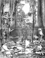
Here's the cover mock-up I settled on, using many of the suggestions I received from about 20 people to whom I sent it for critique. I've managed to get about halfway through the inking now, and I'm going to put up step-by-step photos I took during the process so you can follow along. Remember, this mock-up is a collage of photos and my drawings that I montaged together in Photoshop to form a rough. It's just a pattern to follow. It measures about 11x14."
I decided to try a new style using pen and ink and watercolor pencil painting, and since I haven't done any pen and ink in years (well, ballpoint for my journals, but that's an ENTIRELY different thing), it has been pretty intimidating and I think of all manner of things to help me procrastinate. The pen I'm using is a very fine (.05mm) Copic Multiliner which features waterproof pigment ink. I tested it, scribbling on a piece of the paper I'd use for the cover painting, letting it dry, then wetting and scrubbing it a bit. The lines stayed crisp and firm, with no staining of the white paper.
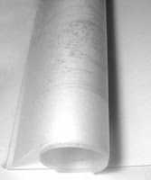
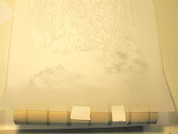
The first step was to trace the mockup onto a large sheet of tracing paper, which I did by putting the Photoshop printout of the cover face down on my light table, then tracing it -- so that the graphite pencil tracing was backward.
Placing this backward
 drawing graphite-side down onto my art paper (Smooth Strathmore Bristol, 400 series), I taped it down at the top,
  then attached a paper towel roll to the bottom edge so that I could roll it up out of the way.
 This is a bit unorthodox. Usually the technique is to burnish the entire pattern down onto the paper,
 but it is easy to smear
 this, and I didn't want to have to erase or repeat the burnishing, so I only planned to burnish down small portions of the design at a time -- you'll see.
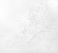
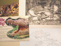
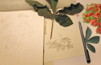
I spent quite a bit of time gathering resource materials because I would need to put details into the finish drawing that I hadn't bothered to trace from the rough.
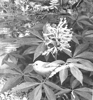
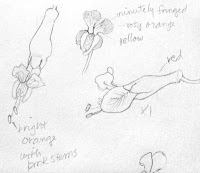
I've shown some of the resources I used: photos I have taken myself, printouts from the web, an actual red buckeye leaf, a sketch I did long ago of buckeye flowers, etc. I'll need all of these not only to get this original inking down, but also to get the color right later when I do the watercolor pencil painting.
Being right handed, I usually start in the upper left-hand corner of a drawing so as not to smear things, but I wanted to do the foreground first,
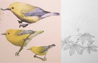 so I started at the bottom edge with the alligator and the prothonotary (pro-THON-uh-tary) warbler perched on a low-growing red buckeye branch. After I had burnished that portion onto the Bristol, I rolled the tracing sheet up to the top of the picture out of the way and left it there so I could work unimpeded.
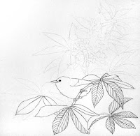
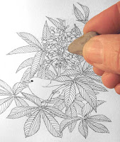
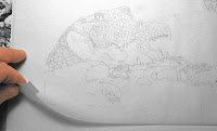
Here are some pictures of the process, including one in which I am erasing the pencil lines out from under the ink. The eraser is a kneaded eraser, and it is gentle enough to remove the pencil without taking out the ink.
Here's a close-up of the warbler in progress and also finished in its shrub.
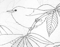
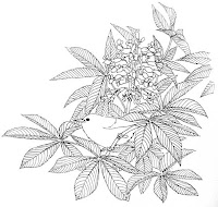
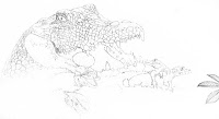
So here we are with the foreground inked, mama alligator assisting her nestlings to hatch by cracking a shell with her teeth (truth!) and the prothonotary warbler commenting from the nearby buckeye.

Now it's time to go to the middleground and insert the otter, who has risen on his hind legs to get a better view.
Actually, I've gotten a bit further along, having inked in the bald cypress with the big b
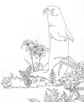 uttresses behind the otter, but I haven't tweaked the photos so I won't put them in yet. Since I haven't installed adequate photo lights to take the pictures, I've just been snapping photos with my Canon PowerShot A590, and have to do quite a bit of tweaking the photos I take to 1. remove the yellow cast, 2. lighten up the whites and darken the blacks, and 3. correct for unbalanced lighting which makes the photos very dark in the lower right corner. It takes several minutes to correct each picture.
So now I've spent most of the morning (OMG, it's after 2pm! I get so engrossed I lose all sense of time!) procrastinating (good at it, aren't I?), and I'm REALLY going to have to get back to work on it.
More later. More workshop stuff, too.

2 comments:
Thank you for doing these progress shots. It's very soimilar to what we do in wtercolour class, except we skip the inking stage.
Your drawings are amazing! The composition of the alligator, warbler and otter is fantastic! I'm not sure I would have thought to put them into one drawing, but you really made it work.
As for the yellow cast on your photos: check the manual for your camera on how to adjust the white balance. The exposure value can also be adjusted up or down past zero. Maybe go up one third (+3), take a photo, then adjust the EV down (-3). Take another photo. Upload them to your computer and look at them side by side. Which is closer to true white? Choose the setting you had for that photo and leave it on your camera. Canon cameras are 'known' for their yellow light cast. Other cameras have a more blue cast. Play with your exposure values and your white balance. Your manual will tell you and it makes a huge difference.
Hi Bonny,
I'm glad you think the composition works. It was a real challenge to squeeze so many swamp things in but still make it all believable.
Great advice about the camera settings! I can see I have some manual reading to do.
Irene
Post a Comment