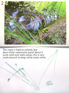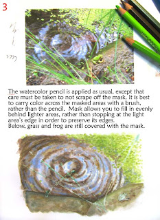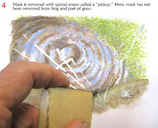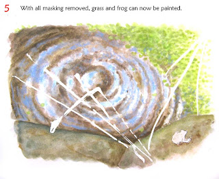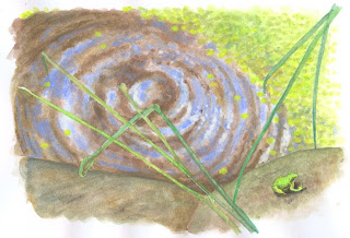
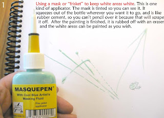
Here's a quick masking demo I used to keep grass blades white so I could paint swirly ripple patterns around underneath, then remove the mask and paint the leaves. The end result wasn't perfect, but it's passable and with more practice it gets better. This was using my own resource photo, with a frog inserted from another photo I had taken.
Without the mask, I would have had to 1) try to paint the leaves opaquely on top of the ripples, which is very difficult since light over dark in watercolor pencils is usually less than satisfactory for fine details, or 2) try to stop and go with the painted swirls, leaving the grass blades white so I could paint them later. This is not a very good solution since it interrupts the swirl with unfortunate effects, destroying the smooth stroke. Remember to click for a larger image (and so you can read the instructions).
So here are the steps I took:
And finally, the end result.
To join me on a virtual sketching trip, download a travel sketch-journal here. I add tutorials to them so you can learn the techniques and details you see in the sketchbooks.
My former workshop students asked me to upload my workshop workbooks to make them available to everyone. So you can also download a workbook and give yourself a workshop! Enjoy!
Monday, June 15, 2009
Watercolor Pencil Demos ~ Kate's Spring Class
I should be blogging the last workshop I had -- it was a hummer and I WILL get to it. But first I need to put up a demo I promised to my classmates in Kate Johnson's Watercolor Pencil Class of a painting I did: "Daniel by Firelight" (see at left). This has to be fast, so mostly the words are on the pictures.
So, here they are. Click on the picture for a bigger image.
I'm starting to work in the upper left corner since I am right-handed. By starting there and working toward the lower right as much as possible, I can avoid smearing or mussing my work. Where I must put my hand on a finished area, I tape a piece of clean paper over the finished part. If you use a piece of loose paper, the PAPER can smear the work, so tape it down.
To clarify #4, the white crayon layer was wet, then dried with a hair dryer before intensifying it with the pencil.
The photos were used only for inspiration. The final result did not look like either photo.
Cleaning the brush on Daniel's jacket made the perfect semi-transparent stroke needed for the barely visible cloth.
It was tempting to color yellow or orange into the white because everyone knows "flames aren't white, they're orange" but I mostly resisted.
The paper is taped right over where the face would be. It doesn't look like it in the picture here.
Always let a picture "rest" as long as possible before saying it's done. When you come back to it after a pause, you can see areas that need improvement.
And the final result, with the edges trimmed in Photoshop and globally corrected for color to make it as close as possible to the original, but no other computer improvements. Daniel likes it a lot.
Subscribe to:
Posts (Atom)